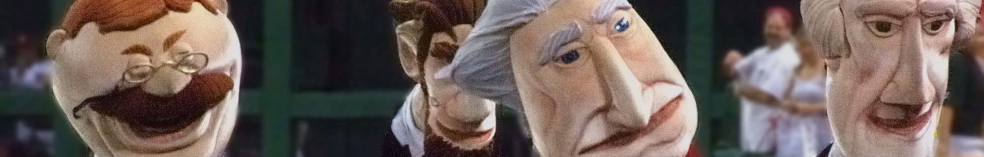
The Washington Nationals will introduce their new marketing campaign this weekend with a TV commercial that brings a new swagger to South Capitol Street.
 The campaign introduces “Natitude,” a new word that was inspired by the way the team played last year, team president Andy Feffer told the Post’s Dan Steinberg.
“There’s no pressure on me. The pressure’s on the pitcher,” says outfielder Michael Morse in the commercial. “I don’t care if you’re the best. I’m gonna get you,” adds second baseman Danny Espinosa.
Following on last year’s successful revamping of the brand, and last month’s “Take Back the Park” campaign, the new slogan continues a dramatic shift from the days when former Nationals president Stan Kasten ran things with a cacophany of colors, logos, slogans, and conciliatory invitations to Phillies fans.
Of course, if the team doesn’t perform, this opens them up to mockery, but I doubt manager Davey Johnson would want it any other way. Well done, Mr. Feffer.

Unless they’ve done a major upgrade, the cacophany still lives all over the ballpark, with the old font “Nationals” still atop the scoreboard in huge letters and loads of the old baseball logos in various places, plus the giant baseball that was supposed to rise out of the Red Loft was never installed because the Lerners didn’t want to buy it.
That said, it’s a simple formula in DC: Win games and people will come to the park and pretend they’ve been with the team since 2005. Put a losing product out there and they’ll stay home to watch The Voice. That’s the real Natitude.
There are a few remnants of the old logo, but for the record, I believe that big baseball was a placeholder in the design for Nationals Park, and remains a carrot being held out for a potential naming rights sponsor. Of course, that all fell apart indefinitely when the economy collapsed, but at some point, don’t be surprised if the stadium gets a new name and the Red Loft gets crowned with a giant beer bottle (or worse).