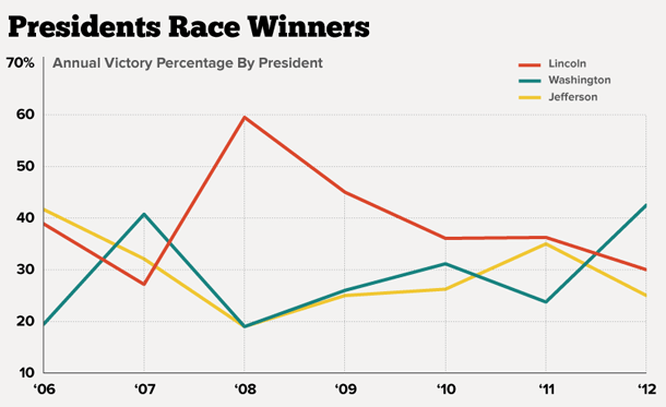
Over the weekend, I noticed that NPR’s data journalist Matt Stiles had created a data set based on this blog (yes, I find these things). His plans weren’t clear until yesterday, when he published Charting Presidential Mascot Races at The Daily Viz.
 Stiles says he tries to create a data visualization every day, and the above chart does a nice job of visualizing Abe Lincoln’s slow decline.
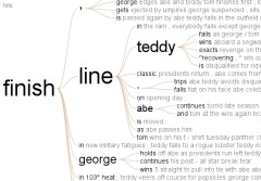
Stiles also set up a link where you can create word trees from the blog based on any keyword you choose.
Check it out …if you want to waste your lunch hour.

